
Redesigning Ikon Pass Checkout
A checkout redesign for a high-traffic ski product, rebuilt in phases after the original plan hit real technical constraints.

Overview
Ikon Pass gives guests access to a network of Alterra and partner ski destinations. The marketing homepage was redesigned every year, but checkout never got the same attention. That gap became obvious once the new Ikon Pass app launched and the three pieces stopped feeling like one product.
The project started as a full checkout redesign. Technical and timeline constraints turned it into a series of phased releases instead. That shift let me work across design system updates, new opt-ins, add-ons, and the introduction of Apple Pay and Google Pay.
MY ROLE
Lead UX/UI Designer
RESPONSIBILITES
User Research, UX Audit, Usability Testing, Wireframing, UAT & Dev Handoffs
TEAMS INVOLDED
UX, Product, Dev
TIMELINE
Jun 2025 - Aug 2026
01 — THE CHALLENGE
A premium product with a high-friction checkout
The Ikon Pass homepage was redesigned annually, but checkout hadn't received the same attention. With a new app launching, the experience needed to become more cohesive across the ecosystem while also addressing existing usability issues.
My objective was to redesign checkout to reduce friction, decrease cognitive load, improve buyer confidence, and create a more cohesive experience between the Ikon Pass website and app.
Existing metrics on the current checkout:
6
CHECKOUT STEPS
14
MINIMUM CLICKS
33.5%
DROP-OFF RATE AT ASSIGN PASSES
56%
EARLY EXITS TO SHOP PASSES
SOME ORIGINAL MOBILE SCREENS

02 — THE DISCOVERY
Understanding the current experience
Before proposing solutions, my team and I looked at checkout from multiple angles: data analytics, existing user flows, stakeholder interviews with our Alterra community, call center feedback, and an audit of the outdated design system. We consolidated everything into an affinity map, a competitor analysis across four comparable hospitality checkouts, and a full site map of the current flow.


03 — INITIAL SOLUTIONS
Key insights and how we solved for them
From the research, five insights drove the direction:
-
Users were leaving checkout to compare pass types, so we needed a comparison/upsell view in-flow
-
Too many decisions were spread across too many steps, so we consolidated related tasks and cut clicks
-
Renewing guests were spending more time than expected at the payment step, so renewals needed an expressed, shorter path
-
The Assign Passes step had the highest fallout for logged-in users, so it needed a UI and usability pass aligned to the new design system to support future features
-
Experience needed to scale between the newly updated design system and support of future features.


We ran a team ideation session, scored ideas on a prioritization matrix (effort vs. importance), and grouped everything into a MoSCoW table before bringing the discovery work to the technical team to confirm feasibility.
04 — VALIDATION
Usability testing & results
After getting all feedback and discovery insights, I worked on mid-fidelity wireframes. These wireframes are to be the visuals for our usability test. While another designer built the mobile prototype, I partnered with my manager to write the usability testing plan, tasks, and questions.
We ran 17 user tests through Maze: 13 external participants and 4 internal team members, each completing two prototype paths, one as a new user and one as a renewing user.
Two flows hit 100% and 92% task success. Testing also surfaced real gaps:
-
An ambiguous kebab menu that needed to read as "Edit"
-
Renewal editing actions that needed to be combined, not scattered
-
Comparison content that wasn't clear enough
-
Confirmation messaging that needed more detail
-
Add-ons that needed a more consolidated experience
We couldn't resolve everything given technical limitations at the time (like fully combining add-ons and insurance), but we incorporated what we could.


05 — DESIGNS
Hi-fidelity wireframes
The full redesign covered hi-fidelity desktop and mobile screens, built on the design system the team had developed over several years, with pattern consistency matching the newly updated app. New elements included a sticky order summary, modal and bottom-sheet behaviors, automatic scroll transitions, and saved payment state animations.

06 — THE PIVOT
When the strategy changed
Once we had complete flows designed with prototypes ready for the dev team, I led an informal review with our design director and technical product manager. In that meeting, a problem surfaced: the original redesign wasn't technically feasible within the timeline. Engineering had identified backend dependencies and complexity beyond a UI redesign.
Instead of shelving the work, we broke it into three smaller, shippable releases:
1
Design system modernization
2
Add-Ons
3
Payment + Apple Pay / Google Pay
I became the primary designer on the resulting workstreams, with guidance and review from my manager. Adapting the strategy to what could realistically ship, instead of holding out for the full vision, ended up being one of the more important parts of the role.
One large
checkout redesign
A series of smaller, shippable improvements
07 — PHASE ONE
Legacy product UI lift
The first release brought the existing checkout in line with the updated design system and app without changing backend functionality.
Here are some key work done:
BEFORE

Pre-Configurator & Cart Removal
Product configuration (pass type, refundability) moved to the homepage, so users skip the cart and go directly into checkout. This was done to lessen the number of steps in the purchase funnel, as well as allowing the user to compare different pass types.
The cart was still accessible for users who needed it, but it no longer interrupted the primary purchase path.
AFTER

BEFORE
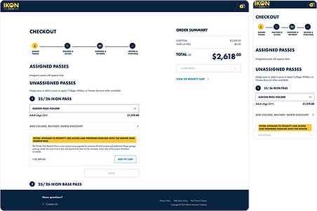
Updated Stepper & UI Lift
Simplified color usage, rounded corners, updated components, and added new elements (like a progress stepper and menu kebab) to match both the design system and the app's visual language.
AFTER

BEFORE

Waiver Interaction
Redesigned into a scrollable container with a fixed "I Agree" action, so users could read the full waiver without needing to scroll to the bottom before agreeing.
AFTER

BEFORE

Shipping & Payment
Added three new elements to support upcoming features: SMS opt-in, new pass requests, and auto-renewal.
Simplified the multi-part payment step with a clearer CTA, removed an unnecessary review step, and updated the order summary.
AFTER

Handoff and UAT
After completing the designs, I prepared the figma file to be handed off to the dev team. The technical manager requested to have each frame annotated of all the changes being done. I used figma annotations to complete that request.
I led a developer handoff review and worked with the development team throughout implementation and refinement.
Once the experience was built, I conducted UAT and communicated discrepancies between the implementation and approved designs back to the development team.
The first phase of the redesign is currently live.

08 — PHASE TWO
Implementing a dedicated add-ons step into checkout
The existing add-on experience was outdated and scattered across checkout, and had never had dedicated design input. The goal was one consolidated step where users could see every add-on relevant to them at once.
OLD

NEW

The new add-ons step landed after pass assignment but before the user saw their final payment amount to support dynamic, cart-dependent pricing. Styling had to account for an added visual state and match designs already live in the app, including 8 resort-specific add-ons with their own branding.
AFTER

Handoff Improvements
This project also introduced a more structured design handoff process. Previously, each designer had their own process of handing off a file to developers. With my manager, I created a standardized handoff procedure that was to be applied to projects moving forward.
Each handoff file was to include:
-
Alternative states & variations.
-
Product flow annotations.
-
Figma annotations & measurements that was to include behaviors, component interactions, animations, content updates, specs, and tokens for fonts & colors.
-
End-to-end product flows that documents returning and new users.

This helped developers understand not only the final UI, but also how the experience should behave across different conditions. Once handoff file is properly prepared, then I led a dev handoff meeting with entire dev team.
Afterwards, I reviewed designs in UAT via jira tickets and documented corrections. This second phase of the redesign is currently live.
09 — PHASE THREE
Introducing Apple Pay & Google Pay
The final workstream focused on modernizing the payment experience and introducing Apple Pay and Google Pay. This was also an opportunity to simplify the existing structure.
While IT were gathering technical requirements and limitations, I did some discovery work on how payment methods are handled else where. While getting the final brief, I did some AI brainstorming & prototyping. I used Claude to create me a script and I applied that script into Figma Make with clear instructions, along with a DS file (we used token studio and I was able to download a file that had all of our design system in it), and a wireframe. It generated some good output and I used that as a simple base on my final designs. When I had run out of credits, I used Figma Agent for further refinement.
Technical Limitations
Billing address placement was the biggest constraint, Affirm required it for pre-check eligibility and credit cards needed validation, while Apple/Google Pay can't collect it. After several rounds with the two developers I worked closely with, I landed on a structure that supported both current and future payment states.
Payment Restructure
I collapsed the existing three-section flow (Contact, Billing, Payment) into two: Preferences and Payment Method. Payment methods became radio tiles, selecting one progressively reveals only the fields relevant to that method, reducing visual complexity and making options easier to compare. Apple/Google Pay tiles don't expand at all, since no additional billing info is needed, which also sets up future express-checkout support without conflicting with required fields.
BEFORE

Radio Tiles
Payment methods were represented as radio tiles. Selecting a payment method progressively revealed the relevant information needed to complete that payment.
This allowed the interface to:
-
Reduce visual complexity
-
Make payment options easier to compare
-
Keep the user focused on the selected method
-
Support additional payment methods without creating a long static form
AFTER (DEFAULT STATE)

Payment Interactions
When user selects a radio tile, the relevant form content is progressively revealed after selection. This allowed the user to input information that is relevant to the payment selection. Because Apple/Google pay did not require billing information, their tiles will not expand and just show the selected tile state.
This method allowed for future state express buttons to not interfere with the radio tiles or any redundant billing/shipping information prior to placing an order. This would align with the Apple/Google express pay guidelines where we can't ask the user for any additional information that is obtained by Apple/Google.
If a user places an order with Apple/Google pay radio tiles, the billing and shipping address associated will be saved and override any previously saved addresses on file. User is able to see that update in their account.
AFTER (CREDIT CARD SELECTED STATE)

AFTER (APPLE PAY SELECTED STATE)

Adjusting for Error State Accessibility
Along the way, a recurring UX/IT review surfaced an accessibility gap: our failed-payment states used inconsistent patterns across platforms and didn't meet WCAG contrast guidelines. We standardized on inline banners, corrected the contrast ratio to 4.5:1, and added descriptive error text and red input outlines.
Handoff and UAT
I followed the handoff process guidelines that I implemented in the second phase for "add-ons".
I worked directly with two developers in a pod-style collaboration model throughout this entire phase. This was a new process our UX team was implementing and I was the first to test it out. We wanted more of a relationship between designers and developers in order to resolve functionality questions early, review alternative states together, and adjust the designs based on what the existing system could support.
I later led a refinement session with the broader development team to walk through the complete payment flows and answer implementation questions. I later transitioned off the project and I did not participate in UAT or post-launch measurement.
10 — FINAL RESULT
Key takeaways and learnings
The original vision was a full checkout redesign. What shipped looked different, but it delivered meaningful improvements without waiting on a complete backend overhaul.
What I Delivered
-
User research and usability testing that clarified what users actually needed from checkout
-
A checkout aligned with the new design system and app
-
A flexible add-ons experience supporting dynamic pricing and per-resort branding
-
A simplified payment experience supporting Apple Pay and Google Pay
-
A more structured design-to-dev handoff process, now used beyond this project
What I Learned
Design isn't always about solving the whole problem at once. The research pointed to a much bigger transformation than we could ship on the existing timeline. Breaking the work into phases let us improve the real experience instead of waiting for ideal conditions. It also showed me how much earlier technical collaboration helps. Working directly with developers on the payment phase surfaced constraints and alternative states far sooner than reviewing finished designs would have.
The biggest takeaway is that good product design isn't only about the ideal user experience, it's about understanding business goals, technical constraints, timelines, team capacity, and finding the highest-value thing you can realistically ship.